Developer Kit · Examples
Diseño personalizado en CalendarWeek
Diseño personalizado en CalendarWeek
Diseño personalizado en CalendarWeek
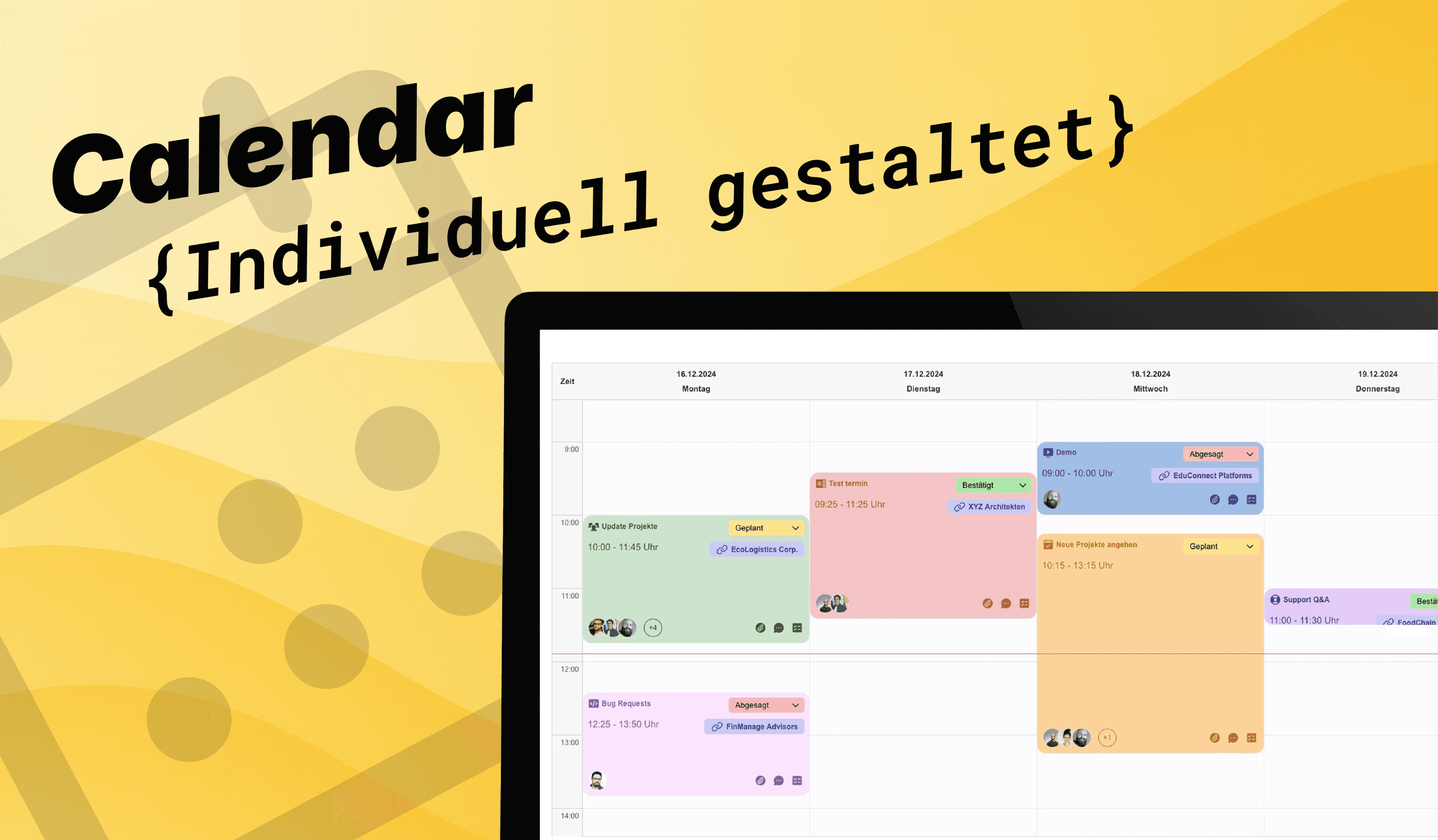
En este artículo os mostramos paso a paso cómo construir, con ayuda de Layouts y widgets complementarios, una Card con diseño personalizado para customCalendarWeek.
💡 No solo aprenderéis cómo anidar widgets de forma elegante, sino que también obtendréis directamente los códigos de ejemplo correspondientes de nuestro setup.
Tanto como plantilla directa (los nombres de tabla, campos e IDs los tenéis que adaptar, claro, a vuestro sistema) como inspiración para vuestros propios diseños en el estilo típico de arcRiderWidget: esta guía os ayuda a llevar vuestro calendario al siguiente nivel, tanto visual como funcionalmente.
Widgets necesarios
- Widget: <a href="/documentation/custom-calendar-week">*customCalendarWeek*</a>
- Mini Widgets integrados: <a href="/documentation/custom-layout">*Layout*</a>*, *<a href="https://www.arc-rider.de/documentation/buttons">*Button*</a>*, *<a href="https://www.arc-rider.de/documentation/select">*Select*</a>*, *<a href="https://www.arc-rider.de/documentation/custom-icon">*Icon*</a>*, *<a href="/documentation/images">*Image*</a>* y *<a href="/documentation/text">*Text*</a>*.*
Let's build together 🚀
Antes de empezar, asegurad que vuestra base de datos de Ninox contiene las tablas y campos necesarios; podéis usar estructuras existentes o crearlas de nuevo.
Para el layout de la card en este caso de uso usamos las siguientes tablas:
<figure><table><tbody><tr><th>
</th><th>Tablas
</th></tr><tr><td><img src="https://framerusercontent.com/images/lP1viIyLdkCNeoESjqzUBAzWc.png" alt="" loading="lazy" />
</td><td>- Clientes - Empleados</p><ul><li data-preset-tag="p"><p>Citas - Participantes de la cita
</li>- Custom Calendar</p><li data-preset-tag="p"><p>Status_Termine - Typ_Termin
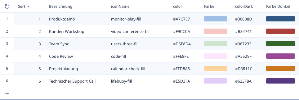
</li></ul></td></tr></tbody></table></figure>*Consejo: * Para la selección dinámica se pueden crear tablas auxiliares/de ajustes, donde se guardan los valores de color e icono para luego llamarlos en los widgets correspondientes.
Así los valores están centralizados y no hay que introducirlos manualmente cada vez que se quieren usar también en otras superficies con distintos widgets.
Diseño personalizado de la card
Integrar los widgets de forma clara
El layout de la calenderCard y los distintos widgets a integrar se crean en la tabla *Citas*, cuyos registros finalmente se llaman dentro de customCalendarWeek.
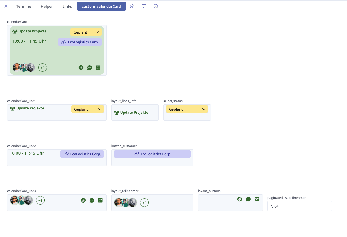
Aquí creamos para cada fila de la card un campo fx con un layout cada uno, y campos fx para elementos como layouts adicionales, Select, Button. Esto ofrece buena claridad al programar los layouts, y además los distintos diseños se pueden intercambiar/sustituir/probar más rápido.
Línea 1

Paso 1: Empezamos con los elementos externalizados para la primera línea.
select_status
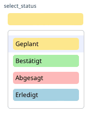
*Widgets usados: customSelect + customLayout*
Código:
let current := this;
arcCustomSelect({
        uniqueId: "Status Termin" + nr,
        recordId: nr,
        field: "Y",
        embedded: true,
        width: "100%",
        height: "25px",
        alignX: "",
        fontColor: "",
        backgroundColor: text(record(Status_Termin,number(Status)).Farbcode),
        borderColor: "none",
        borderWidth: "0px",
        borderRadius: "5px",
        itemsSettings: {
            width: "100%",
            height: "auto",
            borderRadius: "5px"
        },
        clickPosition: "",
        placeholder: "",
        disabled: false,
        reset: {
            title: "reset",
            value: "",
            hide: true
        },
        currentValue: arcCustomLayout({
                uniqueId: "status-bezeichnung-current " + nr,
                embedded: true,
                direction: "horizontal",
                alignX: "left",
                alignY: "center",
                width: "100%",
                height: "auto",
                gap: "10px",
                backgroundColor: text(record(Status_Termin,number(Status)).Farbcode),
                paddingY: "1px",
                paddingX: "1px",
                styles: "border-radius: 5px;",
                scrollSettings: {
                    scrollY: false,
                    scrollX: false
                },
                blocks: [{
                        width: "100%",
                        height: "auto",
                        lineHeight: "",
                        alignX: "left",
                        color: "",
                        styles: "",
                        value: text(record(Status_Termin,number(Status)).Bezeichnung)
                    }]
            }),
        items: let id := nr;
        (select Status_Termin).[{
                title: arcCustomLayout({
                        uniqueId: "status-bezeichnung " + Nr,
                        embedded: true,
                        direction: "horizontal",
                        alignX: "left",
                        alignY: "center",
                        width: "100%",
                        height: "",
                        gap: "0px",
                        backgroundColor: Farbcode,
                        paddingY: "3px",
                        paddingX: "5px",
                        styles: "border-radius: 5px;",
                        scrollSettings: {
                            scrollY: false,
                            scrollX: false
                        },
                        blocks: [{
                                width: "100%",
                                height: "auto",
                                lineHeight: "",
                                alignX: "left",
                                color: "",
                                styles: "",
                                value: Bezeichnung
                            }]
                    }),
                active: number(id.Status) = number(Nr),
                value: number(Nr)
            }]
    })
layout_line1_left
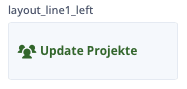
*Widgets usados: customLayout + customIcon + customText*
Código:
let current := this;
arcCustomLayout({
        uniqueId: "calenderCard line1 left" + nr,
        embedded: true,
        direction: "horizontal",
        alignX: "center",
        alignY: "center",
        width: "100%",
        height: "100%",
        gap: "3px",
        backgroundColor: "",
        paddingY: "0px",
        paddingX: "0px",
        styles: "",
        scrollSettings: {
            scrollY: false,
            scrollX: false
        },
        blocks: [{
                width: "auto",
                height: "auto",
                alignX: "center",
                color: "",
                styles: "",
                clickAction: {
                    recordId: nr,
                    type: "popup"
                },
                value: arcCustomIcon({
                        iconSet: "phosphor",
                        name: text(record(Typ_Termin,number(Typ)).iconName),
                        containerSize: "20px",
                        iconSize: "20px",
                        color: text(record(Typ_Termin,number(current.Typ)).colorDark)
                    })
            }, {
                width: "100%",
                height: "100%",
                alignX: "left",
                color: "",
                clickAction: {
                    recordId: nr,
                    type: "popup"
                },
                value: arcCustomText({
                        uniqueId: "appointment-title" + nr,
                        embedded: true,
                        fontSize: "12px",
                        fontWeight: "700",
                        fontColor: text(record(Typ_Termin,number(current.Typ)).colorDark),
                        lineHeight: "1.2",
                        textDirection: "horizontal",
                        value: text(Bezeichnung)
                    })
            }]
    })
Paso 2: Después ambos elementos se colocan en el layout de la primera línea.
calendarCard_line1
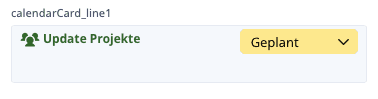
*Widgets usados: customLayout*
Código:
let current := this;
arcCustomLayout({
        uniqueId: "calenderCard line1 " + nr,
        embedded: true,
        direction: "horizontal",
        alignX: "center",
        alignY: "top",
        width: "100%",
        height: "100%",
        gap: "10px",
        backgroundColor: "",
        paddingY: "0px",
        paddingX: "0px",
        styles: "",
        scrollSettings: {
            scrollY: false,
            scrollX: false
        },
        blocks: [{
                width: "fraction",
                height: "auto",
                alignX: "center",
                color: "",
                value: layout_line1_left
            }, {
                width: "35%",
                height: "auto",
                alignX: "right",
                color: "",
                value: select_status
            }]
    })
Línea 2

Paso 1: Empezamos de nuevo con el elemento externalizado para la segunda línea.
button_customer
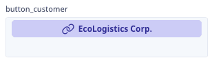
*Widgets usados: customButton + customIcon*
Código:
let current := this;
let lilaDark := "#35339E";
let lilaMiddle := "#D2D2F7";
arcCustomButton({
        uniqueId: "Button-kunde " + nr,
        title: text(Kunde.Name),
        embedded: true,
        width: "auto",
        height: "25px",
        alignY: "",
        alignX: "",
        paddingX: "",
        paddingY: "",
        gap: "5px",
        icon: arcCustomIcon({
                name: "link",
                color: lilaDark,
                containerSize: "20px",
                borderSize: "",
                borderColor: "",
                borderRadius: "",
                iconSize: "20px"
            }),
        iconPosition: "left",
        fontSize: "12px",
        fontColor: lilaDark,
        backgroundColor: lilaMiddle,
        borderColor: lilaMiddle,
        borderRadius: "5px",
        showBadge: false,
    })
Paso 2: Después el elemento se inserta en el layout de la segunda línea.
calendarCard_line2
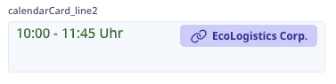
*Widgets usados: customLayout + customText*
Código:
let current := this;
arcCustomLayout({
        uniqueId: "calenderCard line2 " + nr,
        embedded: true,
        direction: "horizontal",
        alignX: "center",
        alignY: "top",
        width: "100%",
        height: "100%",
        gap: "10px",
        backgroundColor: "",
        paddingY: "",
        paddingX: "",
        styles: "",
        scrollSettings: {
            scrollY: false,
            scrollX: false
        },
        blocks: [{
                width: "50%",
                height: "auto",
                lineHeight: "",
                alignX: "left",
                color: "",
                styles: "",
                value: arcCustomText({
                        uniqueId: "appointment-time" + nr,
                        embedded: true,
                        fontSize: "15px",
                        fontWeight: "500",
                        fontColor: text(record(Typ_Termin,number(current.Typ)).colorDark),
                        lineHeight: "1.2",
                        textDirection: "",
                        value: text(Von) + " - " + text(Bis) + " Uhr"
                    })
            }, {
                width: "50%",
                height: "auto",
                lineHeight: "",
                alignX: "right",
                color: "",
                value: if Kunde != null then button_customer end,
                clickAction: {
                    type: "popup",
                    recordId: current.Kunde.Nr
                }
            }]
    })
Línea 3

Paso 1: La tercera línea se divide en dos layouts; además necesitamos un campo fx para calcular la vista limitada a 3 participantes.
paginatedList_teilnehmer
Código:
let maxEntries := 3;
let currentPage := 1;
let list := Terminteilnehmer;
let paginatedList := unique(record(Terminteilnehmer,0).Mitarbeiter)[!= 0];
for listItem in slice(list.Nr, maxEntries * (currentPage - 1), maxEntries * currentPage) do
    paginatedList := unique(paginatedList, record(Terminteilnehmer,listItem).Mitarbeiter)
end;
paginatedList
layout_buttons
*Widgets usados: customLayout + customButton + customIcon*
Código:
let current := this;
arcCustomLayout({
        uniqueId: "layout-buttons " + nr,
        embedded: true,
        direction: "horizontal",
        alignX: "right",
        alignY: "center",
        width: "100%",
        height: "auto",
        gap: "5px",
        backgroundColor: "",
        paddingY: "0px",
        paddingX: "0px",
        styles: "",
        scrollSettings: {
            scrollY: false,
            scrollX: false
        },
        blocks: [{
                width: "auto",
                height: "auto",
                lineHeight: "",
                alignX: "left",
                color: "",
                styles: "",
                value: arcCustomButton({
                        uniqueId: "Button-paperclip " + nr,
                        title: "",
                        width: "25px",
                        height: "25px",
                        alignY: "",
                        alignX: "",
                        paddingX: "",
                        paddingY: "",
                        gap: "5px",
                        icon: arcCustomIcon({
                                name: "paperclip-fill",
                                color: text(record(Typ_Termin,number(current.Typ)).colorDark),
                                containerSize: "25px",
                                borderSize: "",
                                borderColor: "",
                                borderRadius: "",
                                iconSize: "20px"
                            }),
                        iconPosition: "left",
                        fontSize: "12px",
                        fontColor: "",
                        backgroundColor: "none",
                        borderColor: "none",
                        borderRadius: "5px",
                        showBadge: false,
                        actions: [{
                                type: "create",
                                tableId: "",
                                popup: true,
                                changeFieldValues: [{
                                        fieldId: "",
                                        value: ""
                                    }, {
                                        fieldId: "",
                                        value: ""
                                    }]
                            }]
                    })
            }, {
                width: "auto",
                height: "auto",
                lineHeight: "",
                alignX: "left",
                color: "",
                styles: "",
                value: arcCustomButton({
                        uniqueId: "Button-message " + nr,
                        title: "",
                        width: "25px",
                        height: "25px",
                        alignY: "",
                        alignX: "",
                        paddingX: "",
                        paddingY: "",
                        gap: "5px",
                        icon: arcCustomIcon({
                                name: "chat-circle-dots-fill",
                                color: text(record(Typ_Termin,number(current.Typ)).colorDark),
                                containerSize: "25px",
                                borderSize: "",
                                borderColor: "",
                                borderRadius: "",
                                iconSize: "20px"
                            }),
                        iconPosition: "left",
                        fontSize: "12px",
                        fontColor: "",
                        backgroundColor: "none",
                        borderColor: "none",
                        borderRadius: "5px",
                        showBadge: false,
                        actions: [{
                                type: "",
                                tableId: "",
                                popup: true,
                                changeFieldValues: [{
                                        fieldId: "",
                                        value: ""
                                    }, {
                                        fieldId: "",
                                        value: ""
                                    }]
                            }]
                    })
            }, {
                width: "auto",
                height: "",
                lineHeight: "",
                alignX: "left",
                color: "",
                styles: "",
                value: arcCustomButton({
                        uniqueId: "Button-list " + nr,
                        title: "",
                        width: "25px",
                        height: "25px",
                        alignY: "",
                        alignX: "",
                        paddingX: "",
                        paddingY: "",
                        gap: "5px",
                        icon: arcCustomIcon({
                                name: "list-checks-fill",
                                color: text(record(Typ_Termin,number(current.Typ)).colorDark),
                                containerSize: "25px",
                                borderSize: "",
                                borderColor: "",
                                borderRadius: "",
                                iconSize: "20px"
                            }),
                        iconPosition: "left",
                        fontSize: "12px",
                        fontColor: "",
                        backgroundColor: "none",
                        borderColor: "none",
                        borderRadius: "5px",
                        showBadge: false,
                        actions: [{
                                type: "",
                                tableId: "",
                                popup: true,
                                changeFieldValues: [{
                                        fieldId: "",
                                        value: ""
                                    }, {
                                        fieldId: "",
                                        value: ""
                                    }]
                            }]
                    })
            }]
    })
layout_teilnehmer
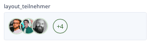
*Widgets usados: customLayout + customImage*
Código:
let current := this;
let colorDark := text(record(Typ_Termin,number(current.Typ)).colorDark);
let colorLight := text(record(Typ_Termin,number(current.Typ)).color);
arcCustomLayout({
        uniqueId: "layout-teilnehmer " + nr,
        embedded: true,
        direction: "horizontal",
        alignX: "left",
        alignY: "center",
        width: "100%",
        height: "",
        gap: "0px",
        backgroundColor: "",
        paddingY: "0px",
        paddingX: "0px",
        styles: "",
        scrollSettings: {
            scrollY: false,
            scrollX: false
        },
        blocks: let imageList := paginatedList_teilnehmer.[{
                    width: "auto",
                    height: "auto",
                    lineHeight: "",
                    alignX: "left",
                    color: "",
                    styles: "margin-right: -10px; border: 2px solid; border-radius: 50px; border-color: " +
                    colorLight +
                    ";",
                    value: arcCustomImage({
                            uniqueId: "Mitarbeier-image" + Nr,
                            title: "Logo",
                            width: "30px",
                            height: "30px",
                            backgroundSize: "cover",
                            class: "",
                            style: "",
                            radius: "50px",
                            borderColor: "",
                            link: shareURL
                        }),
                    clickAction: {
                        type: "popup",
                        recordId: Nr
                    }
                }];
        let plusBubble := [if cnt(Terminteilnehmer) > 3 then
                    {
                        width: "30px",
                        height: "30px",
                        lineHeight: "",
                        alignX: "center",
                        color: colorDark,
                        styles: "margin-left: 20px; border: 1px solid; border-radius: 50px; border-color: " +
                        colorDark +
                        "; font-size: 12px;",
                        value: "+" + if cnt(Terminteilnehmer) > 3 then
                            text(cnt(Terminteilnehmer) - 3)
                        end
                    }
                end];
        array(imageList, plusBubble)
    })
Paso 2: A continuación, ambos customLayouts se insertan en el layout de la tercera línea.
calendarCard_line3
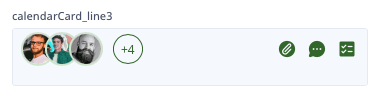
*Widgets usados: customLayout*
Código:
let current := this;
arcCustomLayout({
        uniqueId: "calenderCard Line3 " + nr,
        embedded: true,
        direction: "horizontal",
        alignX: "center",
        alignY: "center",
        width: "",
        height: "auto",
        gap: "10px",
        backgroundColor: "",
        paddingY: "",
        paddingX: "",
        styles: "",
        scrollSettings: {
            scrollY: false,
            scrollX: false
        },
        blocks: [{
                width: "100%",
                height: "auto",
                lineHeight: "",
                alignX: "left",
                color: "",
                styles: "",
                value: layout_teilnehmer
            }, {
                width: "100%",
                height: "auto",
                lineHeight: "",
                alignX: "right",
                color: "",
                value: layout_buttons
            }]
    })
Ensamblar el diseño de la card
Finalmente se pueden ensamblar las líneas en el último layout de la calendarCard. Para que la card se pueda ver completa en citas más cortas, recordad poner scrollY: true en scrollSettings.
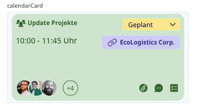
*Widgets usados: customLayout*
Código:
let current := this;
arcCustomLayout({
        uniqueId: "calenderCard " + nr,
        embedded: true,
        direction: "vertical",
        alignX: "center",
        alignY: "top",
        width: "100%",
        height: "100%",
        gap: "10px",
        backgroundColor: record(Typ_Termin,number(current.Typ)).color,
        paddingY: "8px",
        paddingX: "8px",
        styles: "border-radius: 14px;",
        scrollSettings: {
            scrollY: true,
            scrollX: false
        },
        blocks: [{
                width: "100%",
                height: "auto",
                lineHeight: "",
                alignX: "center",
                color: "",
                styles: "",
                value: calendarCard_line1
            }, {
                width: "100%",
                height: "100%",
                lineHeight: "",
                alignX: "center",
                color: "",
                value: calendarCard_line2
            }, {
                width: "100%",
                height: "auto",
                lineHeight: "",
                alignX: "center",
                color: "",
                value: calendarCard_line3
            }]
})*Consejo: Al externalizar los distintos elementos, podéis crear otros diseños y otras vistas mucho más rápido. Por ejemplo, intercambiando las líneas:*
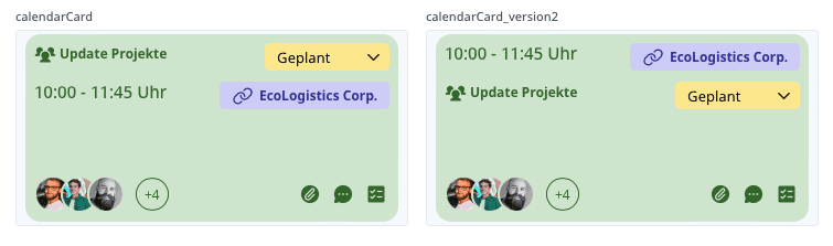
Código:
let current := this;
arcCustomLayout({
        uniqueId: "calenderCard version 2" + nr,
        embedded: true,
        direction: "vertical",
        alignX: "center",
        alignY: "top",
        width: "100%",
        height: "100%",
        gap: "10px",
        backgroundColor: record(Typ_Termin,number(current.Typ)).color,
        paddingY: "8px",
        paddingX: "8px",
        styles: "border-radius: 14px;",
        scrollSettings: {
            scrollY: true,
            scrollX: false
        },
        blocks: [{
                width: "100%",
                height: "auto",
                lineHeight: "",
                alignX: "center",
                color: "",
                styles: "",
                value: calendarCard_line2
            }, {
                width: "100%",
                height: "100%",
                lineHeight: "",
                alignX: "center",
                color: "",
                value: calendarCard_line1
            }, {
                width: "100%",
                height: "auto",
                lineHeight: "",
                alignX: "center",
                color: "",
                value: calendarCard_line3
            }]
    })
Finalizar el diseño
La card terminada se puede insertar finalmente en el widget customCalendarWeek. El layout de nuestra calendarCard se llama en timeEntries dentro del parámetro customLayout.
...		timeEntries: (select Termine where forCalendarWeek = true).[{
                subtitle: "",
                title: "",
                value: "",
                customLayout: calendarCard,
...*¡Importante! * Si definís el color de fondo y un borderRadius en el layout de la card, recordad poner backgroundColor en "transparent" y padding en "0px" en el parámetro styles de timeEntries.
...		styles: {
            backgroundColor: "transparent",
            padding: "0px"
                },
                                                                ...
Código completo de la aplicación de customCalendarWeek:
let current := this;
arcCustomCalendarWeek({
        uniqueId: "customCalendar" + Nr,
        embedded: false,
        height: "800px",
        weekdaySettings: {
            week: week(today()),
            year: year(today())
        },
        weekStart: 1,
        timeZoneBalance: -1,
        timeSettings: {
            timeStart: time(6, 30),
            duration: time(15, 30)
        },
        currentTime: "#f95757",
        dayHighlights: [{
                date: date(2024, 10, 31),
                color: ""
            }, {
                weekday: 6,
                color: "#f9f9f9"
            }, {
                weekday: 7,
                color: "#f9f9f9"
            }],
        lang: clientLang(),
        timeSlotWidth: "372px",
        timeSlotHeight: "120px",
        styles: {
            backgroundColor: "#cccccc11"
        },
        timeEntries: (select Termine where forCalendarWeek = true).[{
                subtitle: "",
                title: "",
                value: "",
                customLayout: calendarCard,
                dateFrom: 'Datum von',
                dateTo: 'Datum bis',
                timeFrom: Von,
                timeTo: Bis,
                styles: {
                    backgroundColor: "transparent",
                    padding: "0px"
                },
                dragAction: {
                    recordId: nr,
                    dateFrom: fieldId(nr, "Datum von"),
                    timeFrom: fieldId(nr, "Von"),
                    dateTo: fieldId(nr, "Datum bis"),
                    timeTo: fieldId(nr, "Bis")
                }
            }]
    })