Mini Widgets
Text
Text
AI Defaults
- Function name
- `arcCustomText`.
- value
- The text content. Supports NinoxScript expressions.
- Use for type consistency
- When `if/else` mixes text and widget, wrap the text branch in `arcCustomText({value: ...})`.
- fontSize
- , **fontColor**, **fontWeight**: Direct properties (not nested).
- truncate
- `true` enables ellipsis when the text exceeds the container width (set an explicit `width`).
- No uniqueId needed
- for simple text display.
Text
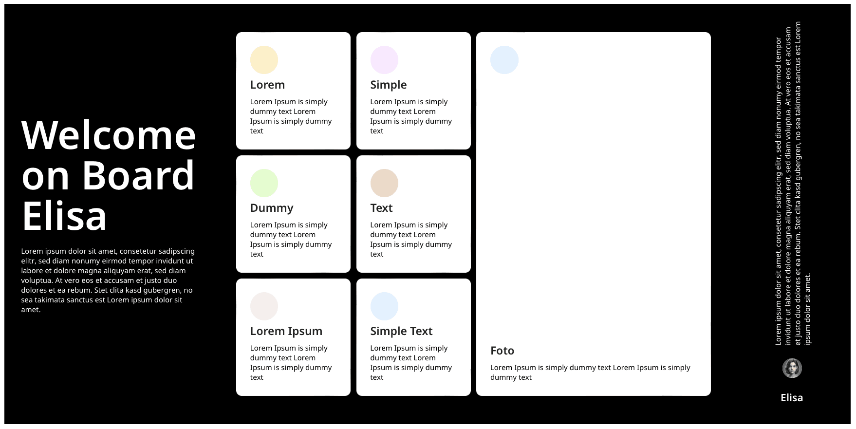
Código de aplicación
arcCustomText({
        uniqueId: " + Nr,
        embedded: true,
        width: "",
        height: "",
        alignY: "",
        alignX: "",
        fontSize: "",
        fontWeight: "",
        fontColor: "",
        lineHeight: "",
        textWrap: "",
        textScroll: "",
        textAlign: "",
        textDirection: "horizontal",
        textDecoration: {
            type: "",
            style: "",
            color: "",
            thickness: ""
        },
        truncate: "",
        value: ""
    })
uniqueId
El * uniqueId* lo asignas individualmente, debe ser único. La razón: si muestras varios customText con distintos settings en tu interfaz, los estilos no se sobrescriben entre sí.
uniqueId: Nr, // Ninox-Feld
uniqueId: "Aufgabe Beschreibung", // Text in "
embedded
El parámetro embedded lo usas cuando el texto no está dentro de otro widget. Por defecto está establecido en true.
embedded: false, // ermöglicht den Standalone Einsatz des Widgets (nicht eingebettet in anderen Widgets)
embedded: true, // wenn Text eingebettet in anderes Widget
embedded: "", // default: true
width
En with defines qué ancho debe tener el contenedor de tu customText.
width: "100%", // Prozent-Werte oder "80px" Pixel-Werte
width: "auto", // witdh passt sich an Inhalt an
width: "", // default: 100%
height
En height defines qué altura debe tener el contenedor de tu customText.
height: "100%", // Prozent Werte
height: "100px", // Pixel Werte
height: "", // default: auto
alignY
El parámetro alignY lo usas para determinar si el contenedor del customText en el eje Y debe estar arriba, abajo o centrado.
alignY: "bottom", // top, bottom, center
alignY: "", // default: top
alignX
El parámetro alignX lo usas para determinar si el contenedor del customText en el eje X debe estar a la izquierda, a la derecha o centrado.
alignX: "right", // left, right, center
alignX: "", // default: left
fontSize
Con fontSize determinas el tamaño de fuente de tu texto.
fontSize: "12px", // Pixel Werte
fontSize: "", // default: 12px
fontWeight
En fontWeight puedes definir el grosor de tu fuente.
fontWeight: "normal", // CSS-Values (bold, lighter etc.)
fontWeight: "800", // Zahl 100-800 in 100er Schritten (400=normal, 800=bold)
fontWeight: "", // default: normal/400
fontColor
Con fontColor defines el color de fuente de tu customText.
fontColor: "#000000", // HEX Werte
fontColor: "rgb(77,166,255)", // RGB Werte
fontColor: "", // default: #000
lineHeight
Con lineHeight determinas el espacio entre las líneas de texto.
lineHeight: "5px", // fixe line-height in px, pt, cm etc.
lineHeight: "1.5", // punkt-getrennte Zahl, multipliziert mit font-size
lineHeight: "150%", // line-height in Prozent von font-size
lineHeight: "", // default: normal
textWrap
Con textWrap determinas cómo debe saltar de línea tu texto. Puedes usar los valores CSS habituales para white-space.
textWrap: "normal", // automatischer Zeilenumbruch, wenn verfügbaren Platz überschritten
textWrap: "nowrap", // Text bleibt in einer Zeile, auch wenn verfügbarer Platz überschritten
textWrap: "pre", // Text wird genau so angezeigt wie im HTML-Code, mit Leerzeichen und Zeilenumbrüchen
textWrap: "pre-wrap", // Text wird umgebrochen, wenn verfügbarer Platz überschritten, behält Leerzeichen und Zeilenumbrüche bei
textWrap: "pre-line", // Text wird wie "pre-wrap" behandelt, aber behält normale Zeilenumbrüche bei und entfernt zusätzliche Leerzeichen
textWrap: "", // default: normal
textScroll
Con textScroll puedes establecer con true o false si el texto, cuando necesita más espacio del que ofrece el contenedor (determinado con width y height), debe ser scrollable o cortarse.
textScroll: true, // Der Text wird scrollbar, wenn er den Container überschreitet.
textScroll: false, // Der Text wird abgeschnitten, wenn er den Container überschreitet.
textScroll: "", // default: true
textAlign
En textAlign determinas cómo debe alinearse el texto: a la izquierda, a la derecha, centrado o justificado a lo ancho de la línea.
textAlign: "right", // left, right, center
textAlign: "justify", // streckt den Text so, dass jede Linie dieselbe Breite hat (wie zB in Zeitungen)
textAlign: "", // left
textDirection
Con el parámetro textDirection puedes determinar si el texto debe orientarse en horizontal o en vertical.
textDirection: "vertical", // vertical, horizontal
textDirection: "", // horizontal
textDecoration
En textDecorationSettings puedes usar el parámetro type para subrayar o tachar tu texto, o crear una línea sobre él, o también tanto debajo como encima del texto. Además, puedes personalizar esta línea con style, color y thickness.
textDecoration: {
            type: "",
            style: "",
            color: "",
            thickness: ""
        }
El parámetro type determina el tipo de línea o su posición.
type: "none", // keine Linie
type: "overline", // Linie oberhalb des Textes
type: "line-throug", // Text wird durchgestrichen
type: "underline", // Text wird unterstrichen
type: "overline underline", // Erzeugt eine Linie ober- und unterhalb des Textes
type: "", // default: keine Linie
El parámetro style determina el estilo de la línea.
style: "solid", // gerade Linie
style: "double", // doppelte Linie
style: "dotted", // gepunktete Linie
style: "dashed", // gestrichelte Linie
style: "wavy", // gewellte Linie
style: "", // default: solid
El parámetro color determina el color de la línea.
color: "#fff", // hex-code Farben
color: "rgb(249, 201, 36)", // rgb() Farben
color: "", // default: #000
El parámetro thickness determina el grosor de la línea.
thickness: "7px", //
thickness: "", // default: 1px
truncate
Con truncate puedes cortar texto largo con ellipsis (…) cuando es más ancho que el contenedor (típicamente con width fijo).
truncate: true, // Text wird einzeilig abgeschnitten mit Ellipsis
truncate: false, // kein Truncate (default)
truncate: ", // default: false
value
En value introduces el valor que debe mostrarse como customText. Puede ser texto escrito directamente entre comillas o un campo de Ninox. Si no es un campo de texto de Ninox, recuerda incluir el valor dentro de *text()*.
value: "Dies ist mein customText.", // manuell eingefügter Text
value: Beschreibung, // Ninox Wert
value: "", // gibst du keinen value ein, wird nichts ausgegeben
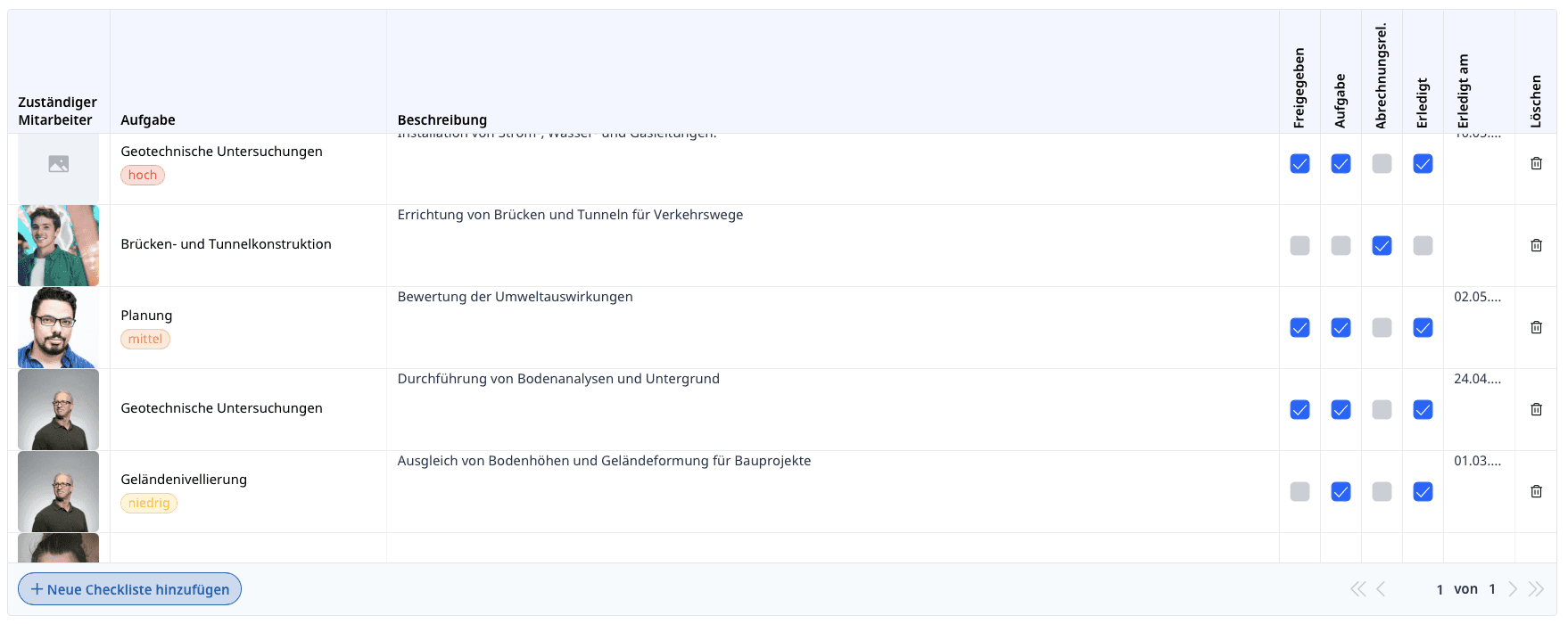
Consejo para columnas estrechas:
En la customTable ahora puedes usar customText para mostrar los títulos de columna en vertical, ahorrando así espacio en celdas que, por ejemplo, solo contienen un checkbox, y dando en consecuencia más espacio a los elementos que lo necesitan💡
---
Idea de función: resaltado tipo rotulador (Handwritten Highlight)
💡 Ampliación planeada: dotar al texto de un efecto realista de «marcador de texto» (como resaltado a mano). Referencia: <a href="https://codepen.io/vii120/pen/KwMBaaY">CodePen</a> — variantes: amarillo, verde, rosa con conic-gradient + linear-gradient.